It is remarkably easy to generate thousands of leads from a great Facebook ad. Of course, you need to know your audience, where to find them online, and promote something people will actually want. And to really boost your revenue, you need to be able to retarget those leads, again and again, to heighten the chances that each one will result in a sale.
But even with all these things in place, you are losing out in a big way if your ads don’t come across in the way you intend. You may spend hours designing the right logo or graphic design to portray your brand, only to later find that you uploaded it in the wrong size.
Since Facebook posts with images see 2.3X more engagement than those without, you could lose out on hundreds of leads if your images are pixelated and blurred or your copy doesn’t engage your leads.
Equally, you want to know the limits imposed on ad copy by the Facebook formats, so you can develop the core message of your branding and marketing activities to fit within them; You need to know how to format your videos to ensure they are viewed in the highest quality possible, without taking so many minutes to load that your audience gives up watching.
In this simple, comprehensive guide, we tell you exactly what you need to know about the Facebook guidelines for 2018 to create the perfect ad, in any format. We take you through the key elements you need to know to make your Facebook ads work with your copy, your images, and your video, not the other way round.
Here are the Facebook guidelines for each format, and how they affect how you write and design your ads:
Single Image Ad Guidelines
(Source: blog.bufferapp.com)
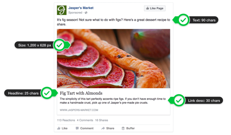
The Single Image ad is the trusty steed of the Facebook advertising world. It is the most versatile as it can be used with almost any objective. It has been around a long time, unlike some of the newer additions to the ad format repertoire. But it is also effective. Single Image ads look much the same as regular newsfeed posts from friends, so they can help businesses connect with audiences in more informal ways.
Images
(Source: jamieehelm.com)
- Size: 1,200 x 628 pixels
- Ratio: 1.91:1
- File type: jpg or png
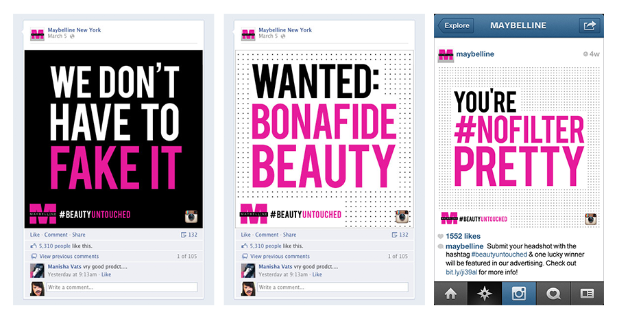
Facebook recommends using images that contain minimal overlaid text. However, text in your images can really help to create brand consistency along with your ad copy. For example, if the message of your ad can be expressed in a hashtag, why not fill the static Single Image space with some call-to-action copy resounding your key phrase, just like Maybelline did in their viral #NOFILTER campaign.
Copy
(Source: www.wordstream.com)
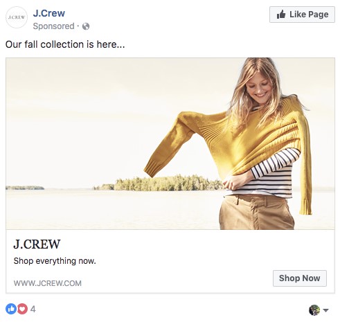
- Text: 90 characters
- Headline: 25 characters
- Link description: 30 characters
There are so many people on Facebook for you to target with your ads. But sending ads out there into a sea of global users is like trying to find customers in your brick-and-mortar store blindfolded. And it won’t get you a load of conversions. The reason Facebook has the best social targeting system of any platform is it allows you to get super specific about the kind of people you want to view your ads.
Here are just a few of the ways you can target your ads on Facebook:
- Custom audiences – target existing customers or subscribers
- Location – target by location (country/city/state)
- Gender – target by gender (male/female)
- Interest – target by interest (such as health/fashion/literature)
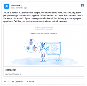
If you are using interest-based targeting, one of the most powerful methods of advertising to niche, untapped audiences, match your copy to your targets. Think about the kind of culture the people who will buy your products are within. What music do they like? What other, similar brands to yours might they already follow? And speak directly to them.
(Source: copyhackers.com)
| Please note:
Under the following two objectives, the image guidelines for Single Image ads are different. For all other Single Image ads, the details above still apply. Promote your page:
Increase app engagement:
|
Carousel Ad Guidelines
(Source: blog.bufferapp.com)
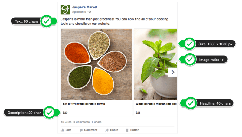
The Carousel ad is great if you have multiple products you want to promote simultaneously, and even better if these products are closely related to each other and targeted to the same audience. The more niche your products, the more niche, untapped audiences you will be able to generate to get them in front of. Use video or images to grab people’s attention and get them scrolling through your products.
Images
(Source: facebook.com)
- Number of Images: Up to 10
- Image size: 1,080 x 1,080 pixels
- Image ratio: 1:1 (square)
- File type: jpg or png
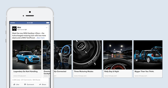
If you want to create brand awareness, the square images in these ads can be used with high-quality, clean, symmetrical product images that users can scroll through. Or, use them to tell your product’s story, showcasing multiple features like Mini did in the mobile campaign above.
Videos
(Source: www.facebook.com)
- Number of Videos: Up to 10
- Format: mov or mp4
- Aspect ratio: 1:1 (square)
- Resolution: 720p
- File size: 2.3 GB (max)
- Facebook length: 60 minutes max
- Instagram length: 60 seconds max
- Thumbnail image size: 1,080 x 1,080 pixels
- Thumbnail image ratio: Aspect ratio of video
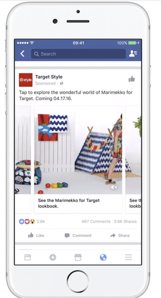
Video Carousel ads are perfectly suited to a cross-campaign with your Instagram account. But remember, the Instagram video limit is 60 seconds – deliver your message before time runs out. The campaign above from Target used the Carousel ad format to expand the horizontal width of a scene. By using videos that, side-by-side, create a swipeable panorama of a single backdrop, Target was able to show the primary character in the ad moving from one part of the scene to the next, across a series of videos showcasing various products. This novel use of the format encourages users to swipe through the carousel to see where the character is heading next and what she will do.
Copy
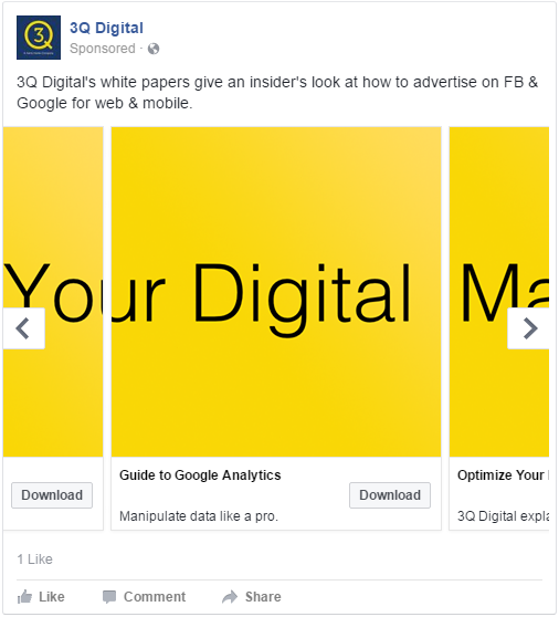
(Source: 3qdigital.com)
- Text: 90 characters
- Headline: 40 characters
- Description: 20 characters
Your Carousel ad text should tell users what they will gain from exploring your carousel further. There’s no point in using a Carousel ad, if you only focus on the first piece of content, product, or video in the series. Whether it’s a sale on a particular collection, an interlinked series of short documentary videos, or a series of tutorials broken up into stages, give potential customers a reason to scroll through the whole series. Use your copy to tell them what they will get from swiping through.
You could even use copy overlayed onto images in your carousel to highlight a particular core message you want to get across. Simple, large, bold copy, on a bright background, such as that used by 3Q Digital in the campaign above, can really grab attention among reams of other busy, design-heavy graphics and glossy photos.
| Please note:
You can use this ad type with every objective except: boost your posts, promote your page, reach people near your business, raise attendance at your event, and video views. If you want to run a Carousel ad using the video views objective, you’ll only be able to use videos in your ad. And if you’re using the app engagement & offer claim objectives, Facebook will only allow you to use images in your Carousels. |
Single Video Ad Guidelines
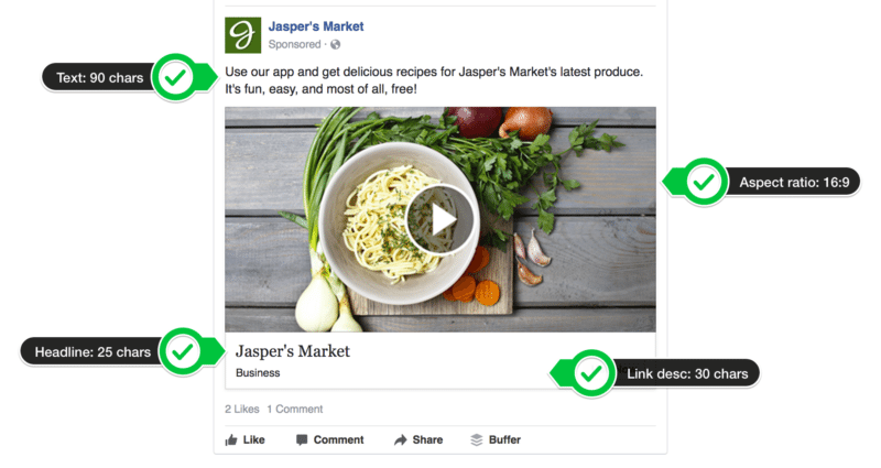
(Source: blog.bufferapp.com)
Users watch 100 million hours of video on Facebook each day. Single Video ads are prime opportunities for you to entertain and engage your customers in more immersive ways. They can be used to showcase your brand and it’s story to customers, or explore a product or products in detail, following a more traditional, hard-sell, promotional approach. Whatever you want to encourage your users to do, use high-quality video that translates well on mobile, and make sure your videos have captions to optimize them for “sound off” contexts (85% of video is watched without the sound – don’t lose out on those leads).
Videos
(Source: socialmediaexaminer.com)
- Format: mov or mp4
- Aspect ratio: 16:9
- Resolution: 720p
- File size: 2.3 GB max
- Facebook length: 120 minutes max
- Instagram length: 60 seconds max
- Thumbnail image size: 1,200 x 675 pixels
- Thumbnail image ratio: Aspect ratio of video
- Caption length text: 2,200 characters max
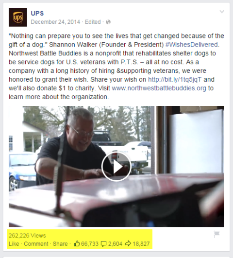
Short, human interest stories do extremely well on Facebook. Content aggregators such as George Takei and 60 Second Docs are just two examples of how human interest stories can successfully create an emotional connection with audiences and generate a community of interested followers. Marketers are beginning to realize the power of short video documentaries in Facebook ads. UPS were early to get in on the human-interest-documentary game, with ads such as the one above highlighting the impact of their ongoing support for U.S. veterans. This campaign did a great job of generating support, trust, and awareness for the brand (and just look at how much engagement this post produced!!).
Copy
(Source: www.yesandyes.org)
- Text: 90 characters
- Headline: 25 Characters
- Link description: 30 characters
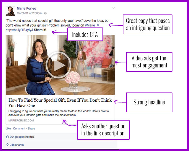
Videos are often set to autoplay on mobile devices and some browsers. But this doesn’t happen with every device, so you can’t let your videos speak for themselves. The campaign above from Marie Forleo draws users into watching the video with its copy. Using a quote from your video tutorial, documentary, or ad creates brand consistency and gets users wanting to find out more. Summarizing the main message of your video in the form of a question demands involvement, and finishing with a call-to-action such as “Read more” or “Share it!” is a great way to tell users exactly how to benefit from your ad.
| Please note:
These ads work with every objective except for product catalog promotion. |
Slideshow Ad Guidelines

(Source: bufferapp.com)
The slideshow ad type allows you to create a video slideshow with up to 10 images included. It can be an easy way to produce a narrative ad without having to pour loads of time and effort into video production.
Images
(Source: cpcstrategy.com)
- Image size: 1,280 x 720 pixels
- Image ratio: 16:9, 1:1 or 2:3
- Video upload format: mov or mp4 file types
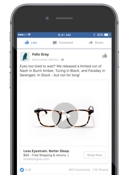
You need to use these ads to create a story, even if this is hashed out in just a couple of images. Don’t put random product images together to create a slideshow of what you want users to buy. Create visually stunning images in series, just as you would with a Carousel ad, taking your audience from one logical step to the next. Whether it’s a series of photos honing in on the particulars of a single product, or shots of a luxury product from multiple angles, use Slideshow ads to create a connection between different images like you would in a storyboard.
Copy

(Source: cpcstrategy.com)
- Text: 90 characters
- Headline: 25 characters
- Description: 30 characters
Due to the narrative nature of slideshow ads, they can be extremely useful for explaining complex processes, such as how to use an app. Advertising apps with video slideshows instead of HD videos means people need less bandwidth to see what those apps can do. Your copy should complement these slideshows by telling people exactly why they need to watch them. Use action-verbs at the start of your sentences so the imperative to “do” – to download your app or use a new feature – is the first thing to enter potential customers’ minds. In the DoubleDown Slots & Poker ad above, they went for “Play,” but other action-words such as “Read,” “Watch,” and “Subscribe” are also effective at presenting clear, persuasive messages to users that encourage them to take action.
| Please Note:
Try to use images that are all the same dimensions. If you use images of different sizes, your slideshow will get cropped to a 1:1 square. Video ads are available for every objective except product catalog promotion. |
Canvas Ad Guidelines
(Source: facebook.com)
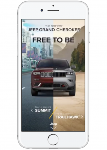
Canvas ads are the newest kids on the block. They’re only available on mobile devices, but they enable you to create highly engaging mobile ads. When people tap on a Canvas ad, they’re taken into a full-screen experience where they can interact with your branded content. Video-heavy content is perfect for this placement opportunity, with the ability to really show off your business’ signature style in a fully-immersive way.
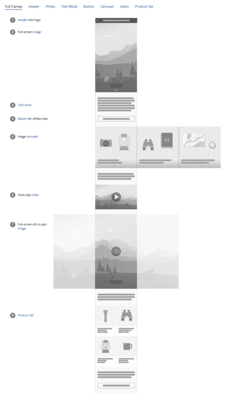
Canvas ads are composed of multiple customizable elements:
- Ad unit
- Photos
- Tilt-to-pan images
- Video
- Carousel
- Text block
- Buttons
- Header
(Source: bufferapp.com)
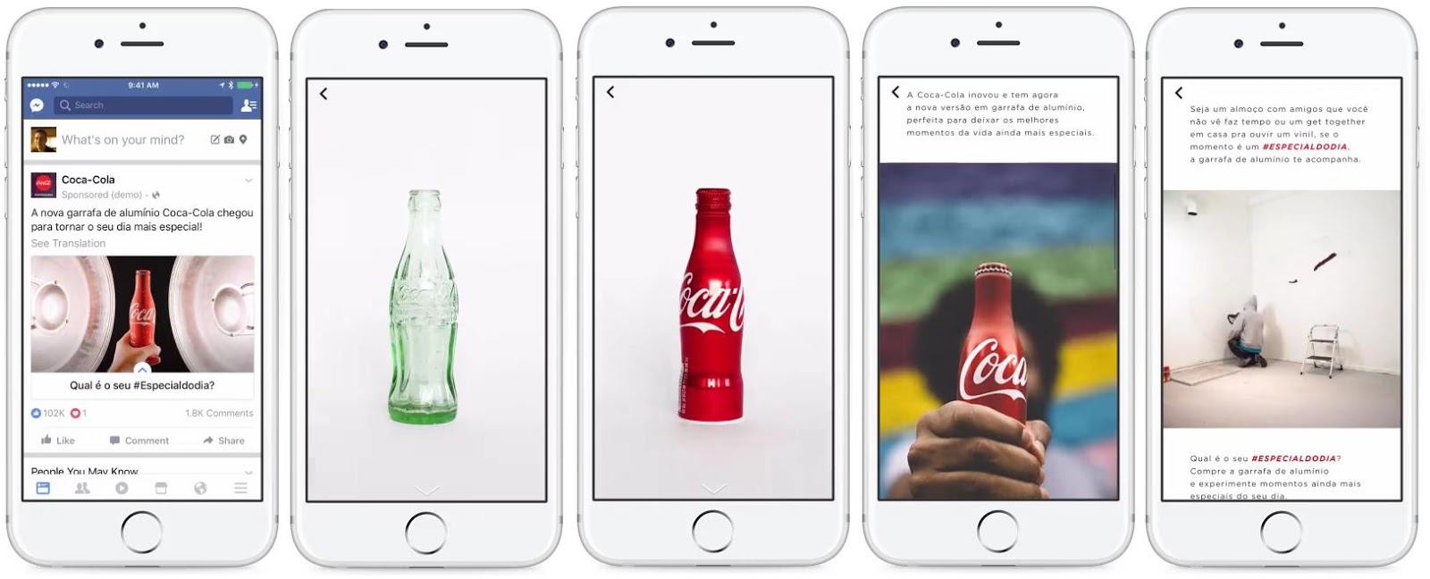
But you don’t have to use every element available to you when you build your Facebook Canvas ads. Be creative. In just a single second, more video will travel across the internet than you could watch in almost two years of doing nothing else. That doesn’t mean people will watch until the end. Only use the elements available to you that will best convey the core message you want to get across. The majority of users will not watch a video for more than around 15 seconds. What message will you send about your brand in these precious moments to portray it in the best light?
(Source: blog.timeuniversal.vn)
The Ad Unit
(Source: jrenn.com)
- Text: 90 characters
- Headline: 45 characters
- Description: 30 characters
- Image size: 1,200 x 628 pixels
- Image ratio: 1.9:1
- Video format: mov or mp4
- Video aspect ratio: 16:9 or 1:1
The ad unit is what users will see in their News Feed.
Photos
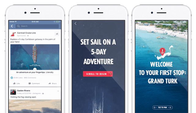
(Source: reshiftmedia.com)
File types: png and jpg
Number of images: Up to 20 photos
Image sizes and ratios:
- Fit to width (linkable):
- Image width: 1,080 pixels
- Image ratio: Full width of screen by default
- Fit to width (tap-to-expand):
- Image height: 1,080 pixels (minimum)
- Image ratio: Full width of screen by default
- Fit to height (tilt-to-pan):
- Image height: 1,920 pixels
- Image width: between 3,240 and 5,400 px (3-5x width of screen)
A Canvas ad photo is a full-screen image aimed to produce stunning HD experiences.
| Please note:
Canvas photos come in three different aspect ratios – each of which rely on different guidelines for sizing. A full-width image is 1,080 pixels but you can use wider images if you select the fit-to-height option. A full-height image is 1,920 pixels tall but you can use a taller image if you choose the fit-to-width option. With the tilt-to-pan option you can upload photos that are wider than the screen – people can then tilt their phone to pan through the image from side to side. |
Video
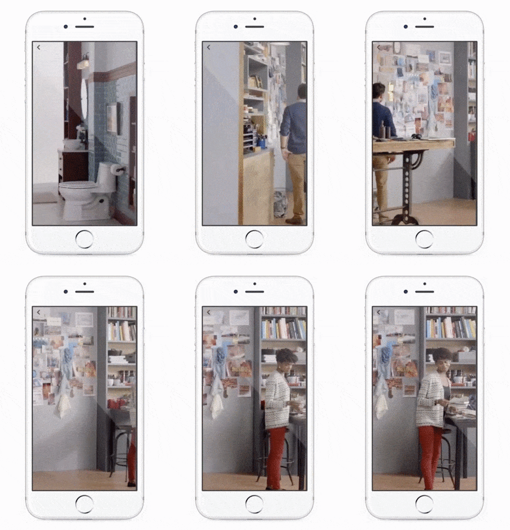
(Source: instapage.com)
- Format: mov or mp4
- Length: under 2 minutes
- Resolution: at least 720p
- Orientation: portrait
- Thumbnail: first frame of video
The video element of the Canvas ad enables you to create fullscreen, engaging video content to be displayed on your users’ mobile devices.
| Please note:
Landscape-oriented videos automatically resize to portrait with Canvas ads. |
Carousel
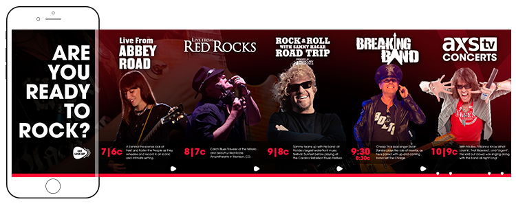
(Source: guptamedia.com)
- Size: 1,080 pixels max width, 1,920 pixels max height
- Ratio: Images can be full or partial height but must be the same size
- File type: png or jpg
- Number of images: Up to 10
This component allows you to upload 2-10 images displayed in fullscreen, carousel-style format. Each item in the carousel can be linked to a different page, and your audience can scroll through each page on their mobile device to interact.
| Please note:
Use the same dimensions for all the images you display in your Carousel. If your images are different sizes, they’ll get cropped to match the first image. Images in the Carousel component of Canvas Ads use the full width of the screen by default. |
Text block
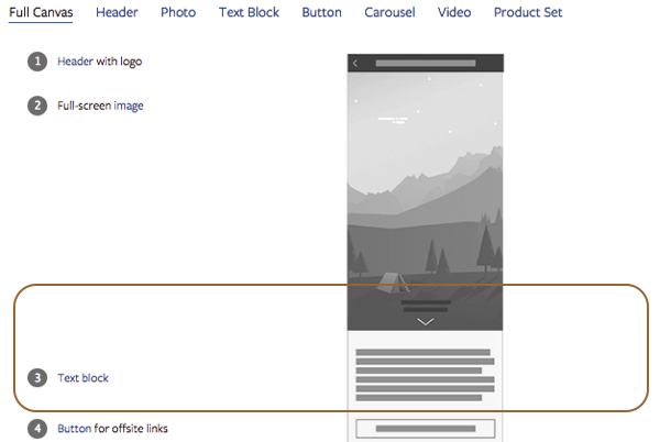
(Source: wordstream.com)
- Character limit: 500 characters max
- Font size: 6-72 point
- Font color: #rrggbb
- Font style: Bold, italic or underlined (can only be applied to the whole text block, not individual phrases or words)
- Font alignment: Left, center, or right
- Font options: Serif or Sans Serif
Use this component to create a block of text to help add context and tell people more about your product or brand.
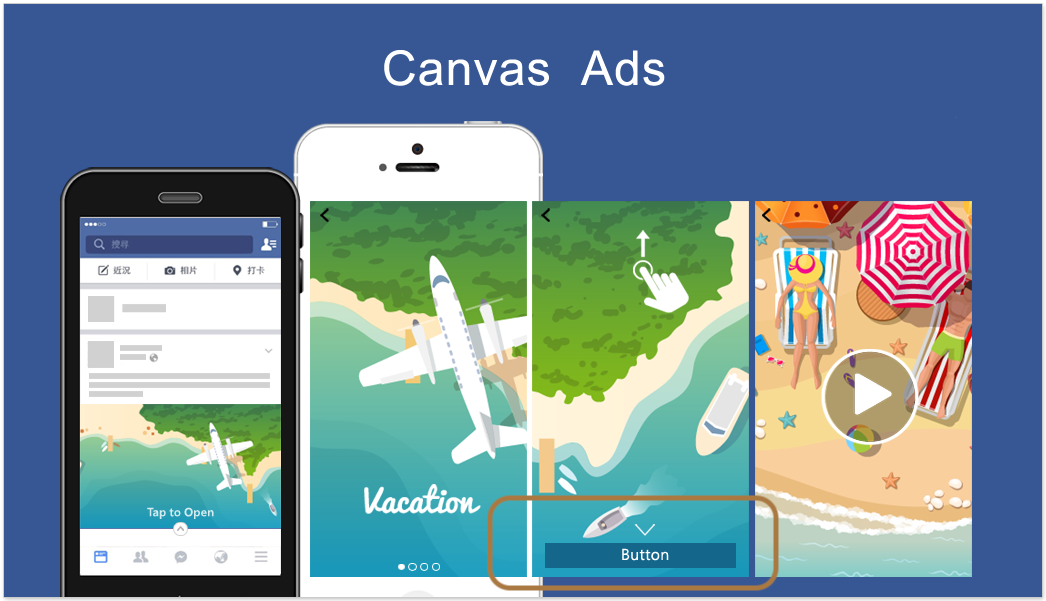
Buttons
(Source: addodigital.co)
- Height: 48 pixels
- Text: 30 characters max
- Options: Serif or Sans Serif
Each Canvas ad must have at least one call-to-action button, which can be linked out to an external URL.
Header
(Source: degordian.com)
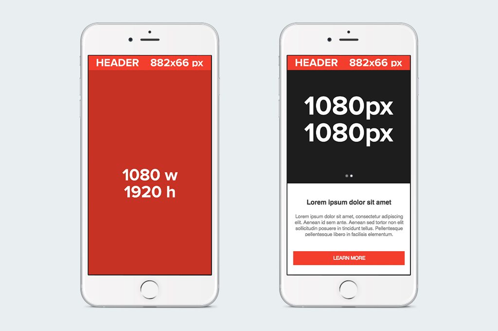
- Image size: 66 pixels (max height) x 882 pixels (max width)
- File type: png
The header component allows you to add a bar to the top of the screen displaying your logo or brand name, so users will always know that the great content they are experiencing comes from you.
Going Forward
As you start to craft your Facebook ads you will also need to begin thinking about how you are going to reach the right audience and get them to convert. Interest-based targeting is a great feature of the Facebook ad system. But everyone else is using Facebook to advertise too.
Just because someone clicks to “follow” a business or media outlet covering issues and themes that your product addresses, this does not mean that they aren’t already being targeted by thousands of other businesses in your niche – and possibly with better ad campaigns and higher ad spend.
Using ConnectExplore, you can see exactly how each interest is currently performing, find other profitable interests related to your keywords, and narrow down your targeting to the interest-groups that have already shown high engagement on the Facebook platform. Only pay for ads that will be displayed to the most promising leads to reduce ad spend and increase the likelihood of converting each lead you target into making a sale. Click here to see exactly what the ConnectExplore software could do for you.
Use the guidelines we have given you in this post to create stunning ads that really stand out to your audience, then use ConnectExplore to target the right people for the highest returns on your ad spend.


