There’s no hiding the fact Facebook has endured a tough time in the last few months. The Cambridge Analytica scandal has raised serious questions about how the world’s largest social network handles data. Despite all this, the world’s biggest social media network still retains 2.2 billion monthly active users worldwide.
That’s 2.2 billion people logging into Facebook each month. On top of this, 1.4 billion log in each day.
Those numbers alone graphically illustrate Facebook’s huge advertising potential.
Leading companies such as Red Bull, Nike, and Amazon all successfully use the platform for their campaigns. Your local business can match their success without having to match the multi-million dollar budgets.
Creating Facebook ads that drive revenue to your business requires a multi-faceted approach. You need to consider the following factors:
- Targeting: This is what separates Facebook ads from other forms of advertising. You have the ability to target your audience based on a range of criteria including
- Demographics (Age, Gender, Religion etc)
- Location
- Interests
- Behaviors
- Budget: Your business will not have an infinite budget for social media advertising. So, consider where to spend your resources and maximize your returns.
- Creating your ad: The content and design of your ad need to be thought-out with the audience in mind. Identify your target market first and then create your ad.
- Plan: Have a plan for your campaign from start to finish. Consider the landing pages and where you want your audience to go after clicking your ad. This will be key to conversions and profitability.
We’ve put together a list of some of the best Facebook Ads we’ve seen, and what you can learn from them. The examples are from a range of different businesses to give you an idea of how powerful the platform can be:
1. Moo Business Cards
(Source: Author’s screenshot)
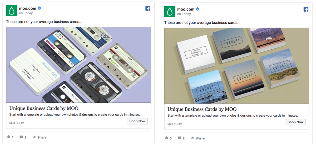
This is a prime example of where simplicity works. Moo allows its customers to create customized business cards. The single image design, together with focused content, displays exactly the service the company provides.
The image also demonstrates the ability to create unique business card designs. The message below makes it clear it’s a relatively easy process that can be completed in “minutes.”
Why we like this ad:
- Focused: The ad is not over-hyping its message. The tagline “Not your average business cards” details what it’s about and supports this with the image.
- Professional: If you’re looking for a business card, you’d want to work with a creative and professional company. The ad demonstrates both skills.
- One CTA: The best converting ads have one clear CTA. In this case, it’s “Shop Now.”
2. Dollar Shave Club
(Source: Pinterest.com)
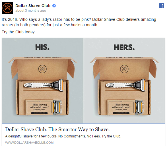
The Dollar Shave Club has long excelled in digital marketing. Focused, humorous, and engaging, the company’s campaigns have regularly hit the spot. This example is no different.
Initially aimed at men, the business has worked to broaden its appeal to women. Instead of coming up with new products, the team simply came up with a new way to market its club. The point of the ad is to show that the Dollar Shave Club’s razors can be used by both men and women. In today’s social climate, it’s a powerful and positive message.
Why we like this ad:
- Succinct: The message is loud and clear. Both men and women are welcome to join the club. The fact that it’s the same product shows how marketing can make a real difference
- Inviting: “Try the Club” sets the tone for this ad. It’s not a hard-sell, which can be a turn off for potential members, but invitational instead.
- Smart use of images: The image shows what members can expect when they sign up to the club.
3. NatureBox
(Source: Hubspot.com)
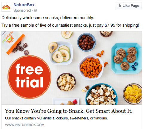
Food is one of those products that can sell itself. We all get hungry and crave certain dishes, so NatureBox follows this principle with its Facebook ad. “You know you’re going to snack,” is something most of us can relate to.
The image of the typical snacks the company sells is attractive and full of color. As you scroll down the newsfeed, you’re not going to miss this ad. NatureBox also uses a contrasting color to make the CTA stand out, with the offer of a free trial.
Why we like this ad:
- Focus on the product: Everything about this ad is focused on the healthy, wholesome products NatureBox sells. The assurance of no artificial colors, sweeteners, or flavors is a bonus.
- Clear CTA: The CTA is bold and clear. Free trials have been proven to be an effective way to attract new customers. The transparency in including the shipping costs prevents any nasty surprises.
- Relatable content: We all snack from time to time, so the content is relatable as well as engaging.
4. MindTitan
(Source: Author’s screenshot)
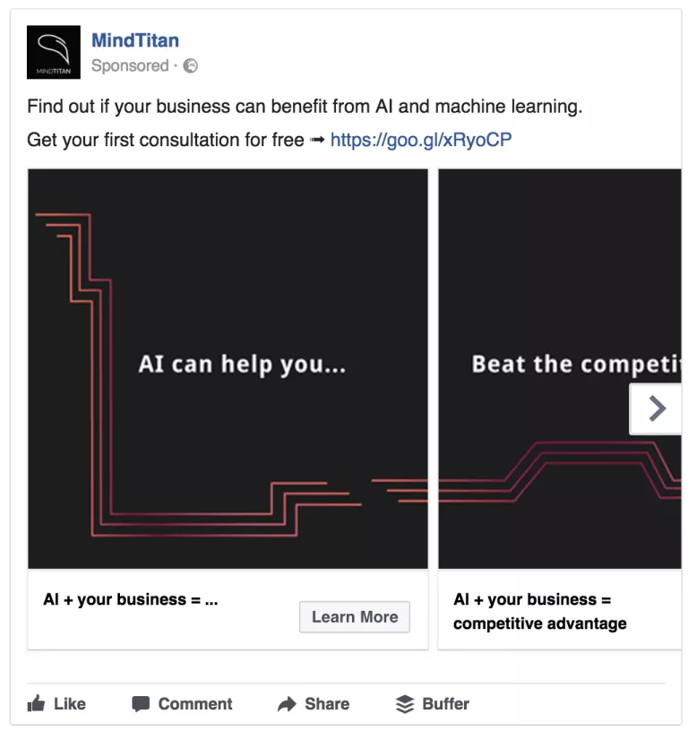
One of the options for Facebook ads is to use the carousel model. Most companies use it to sell multiple products or services. MindTitan took an even smarter approach, using it to tell a story. AI is one of the biggest trends in the business world, as owners seek ways to make their businesses more efficient.
Mind Titan taps into this by selling itself as a thought-leader in AI for businesses. “Find out if your business can benefit from AI” is an engaging line aimed at capturing its target audience. The offer of a free consultation offers further reassurance that this company knows what it’s doing.
Why we like this ad:
- Engaging: The carousel model entices you to find out more and complete the “story.” in this case, it explains the different ways AI can help your business. Engaging and fun, it’s an ad that you’re likely to remember.
- Valuable content: MindTitan uses its ad to show how AI can potentially add value to your business.
- Memorable: Using a carousel in this way is an original idea. People are always more likely to remember ads that stand out, and this one does.
5. Airbnb
(Source: Author’s screenshot)
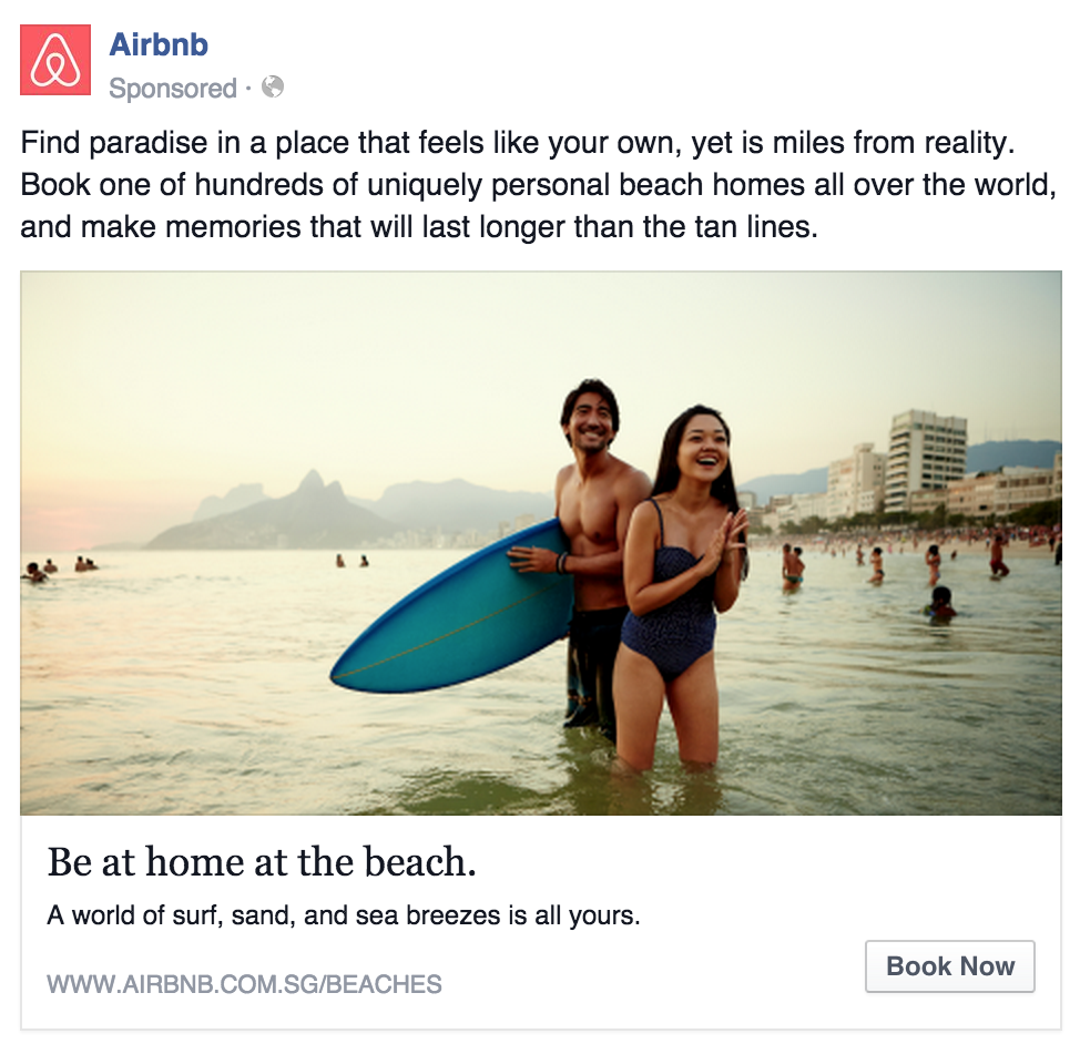
Airbnb has quickly established itself as one of the world’s leading accommodation platforms. It sells itself as an alternative to dreary, dull hotel rooms. As a result, the company dedicates much of its marketing to selling a lifestyle, rather than the product themselves.
This ad is no different. The opening paragraph taps into the idea of “paradise” and the image shows the beach lifestyle. The company is selling the experience, rather than the accommodation itself. This appeals to Airbnb’s target audience, who tend to be more adventurous travelers.
Why we like this ad:
- Creates a vision: The ad invites you to create your vision of a beach paradise. This could be a quiet, peaceful tropical island in the Pacific or the party beaches of Ibiza. The point is, Airbnb can provide both, and you can find your own “uniquely personal home.”
- Enticing image: For Airbnb’s target audience, there a few images more enticing than a fun, evening scene at the beach. The image alone would attract attention on any newsfeed.
- “Book Now”: The CTA, placed at the bottom of the ad, is the final trigger. “Book Now” is a powerful term, especially if you have that vision of paradise in your mind.
6. Kit & Kin
(Source: Author’s screenshot)
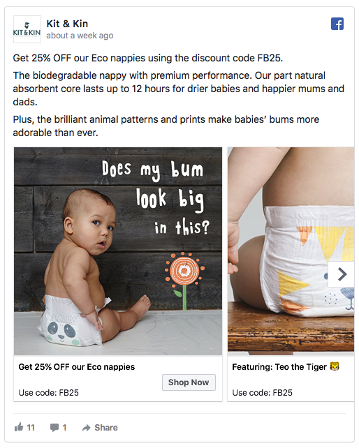
Kit & Kin is an online store that sells eco-friendly nappies and wipes. The company incorporates humor in the first image of the carousel. The special offer is another enticing feature of this ad, offering 25% off using a code.
The text details how the biodegradable nappies offer a premium performance, lasting up to 12 hours. The animal prints are an additional selling point.
Why we like this ad:
- Humor: Businesses can be afraid to use humor in their ads, but careful use of it can be rewarding. In this case, “Does my bum look big in this?” is something we can all relate to and laugh about.
- Multiple products: As we’ve said before, a carousel ad is a great way to promote multiple products.
- Special offer: If you’re looking to attract new customers, then a special offer is an effective way of doing this.
7. BlueHost
(Source: Author’s screenshot)
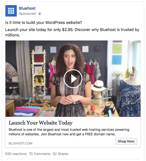
Out of all the posts on Facebook, it’s the ones with videos that have the highest engagement rates. Web hosting service, BlueHost, uses a video to retarget those who have abandoned their carts.
The video shares a personal story from a BlueHost user who explains the benefits of having her own website. The message that BlueHost is one of the most popular and trusted web hosting services around is direct and cuts through to its target audience.
Why we like this ad:
- Video: Using images is a great way to grab attention on the newsfeed, but if you want to engage with your audience, videos can be more powerful.
- Endorsement: The fact that a client is selling BlueHost rather than an employee or actor, adds a layer of trust and authenticity.
- Urgency: The message of “launch your site today for just $2.95” is enticing to people who have already demonstrated an interest. It’s not hard-sell, but a nudge in the right direction.
Conclusion
Facebook offers an unbelievable platform of 2.2 billion monthly users for your business to market to. That’s the exciting part.
The reality is that most of them are simply not going to be remotely interested in your products or services.
However, you can target your ads to the right audience. To realize the full potential of advertising on the world’s most popular social media network, you need to master the Facebook Ad Manager.
It can be a tedious exercise, setting up Custom Audiences and deciding which options to go with. At Connectio, we make this task easier and you can even automate the whole process.

